
English

Views: 0 Author: Site Editor Publish Time: 2026-10-27 Origin: Site


Small text on woven badges has no universal minimum that guarantees readability. A letter can be technically formed by a loom and still be difficult to recognize on a finished garment. The result depends on actual letter height, stroke width, spacing, contrast, weave construction and the available artwork area. If a quotation promises exceptionally small lettering, treat that value as a supplier-specific capability to verify with your own design. The useful target is the smallest text your audience can read on the finished badge, after its border, backing and attachment have been included.
The minimum useful size for text on woven badges is a design-specific approval decision. Start with the reading task and final physical dimensions, then ask the production team to confirm whether the proposed lettering can be woven clearly.
A short name viewed at close range presents a different task from a job title intended to be recognized across a room. A tiny commemorative date may be acceptable as a secondary detail, while an employee name must remain easy to distinguish. Before discussing millimeters, identify which words are essential and how the badge will normally be viewed.
Lettering claims also need a clear measurement definition. “Text height” may refer to capital height, the height of a particular letter, or the complete line including ascenders and descenders. Font point size describes the font's design space and does not directly establish the visible height of its woven letters. Specify actual artwork measurements instead.
For woven badges with mixed-case text, measure the capital height and inspect the smaller lowercase bodies separately. A design can meet a nominal capital-height target while its lowercase letters remain crowded. Likewise, a narrow font may fit a long name but leave little room inside the letters.
Do not transfer a number from embroidery or printing to weaving without review. Different processes create detail differently, and a supplier's advertised minimum may assume a particular font, thread and contrast. A physical sample of your own wording provides a more relevant answer than a minimum quoted without its conditions.
Text on woven badges depends on the survival of strokes and the spaces between them. Height is only one variable. A slightly larger letter can still fail if its internal openings close or neighboring strokes merge.
The open spaces inside letters such as A, B, e and a are called counters. These spaces must remain distinct in the woven result. A heavy font can produce strong outer shapes but close small counters. A very light font can preserve openings in the artwork while leaving strokes too fine to reproduce consistently.
Choose a typeface with clear, open forms and moderate stroke weight. Avoid assuming that “bold” automatically means readable. Compare the woven result of the complete word, particularly letters that occur repeatedly or that differ by only one small feature.
Closely packed letters can turn “rn” into something resembling “m,” or make “I,” “l” and “1” hard to distinguish. Woven badges carrying codes, names or abbreviations need special attention to these combinations. Ask someone unfamiliar with the wording to read the sample without seeing the artwork first.
Spacing also includes the gap between text lines and nearby graphics. A line that appears clear in isolation may merge visually with a crest or decorative outline. Reserve blank space around essential lettering rather than using every available part of the badge.
Strong light-dark contrast usually helps the reader separate text from its background. Two colors can look different on a monitor yet have similar visual brightness in yarn. Gloss and lighting can also change their apparent separation. Review physical thread combinations rather than relying entirely on a screen mockup.
For multicolor woven logo badges, consider the contrast immediately behind the smallest words. The overall logo may be colorful while the critical text still needs a simple, quiet background.
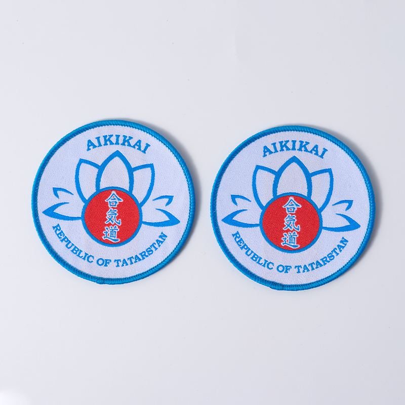
For woven badges, the usable artwork field is smaller than the outside dimensions whenever borders, edge clearance or an attachment line occupy part of the face. Establish that field before shrinking the text to fit.
Consider an illustrative rectangular layout that is 60 mm wide overall. If the design reserves 4 mm at each side for the frame and artwork clearance, the text field is 52 mm wide. These are planning dimensions, not a manufacturing recommendation. The example shows why a logo sized to the entire outer rectangle can become too tight after finishing is added.
Make the drawing distinguish the cut line, border extent, sewing line and artwork boundary. They serve different purposes. A thick stitched frame may visually dominate a narrow badge even when it does not physically cover the letters. A sewing line can also interrupt text that sits too close to the edge.
Scaling woven badges down changes every dimension in the artwork. Reducing a drawing to 80% reduces letter height, stroke width and gaps to 80% as well. A proof can therefore remain recognizable on a large screen while losing critical spaces at the actual production size.
Curved text needs its own review. Letters around a circular crest may be compressed toward the inner arc, while the longest words determine the overall fit. Do not judge the entire ring from one short word. Inspect the smallest letter, tightest pair and narrowest gap throughout the layout.
A useful order of revisions is to remove unnecessary wording, widen the text area, simplify the font and adjust the border. Increase the overall size if the placement allows it. Shrinking essential lettering should follow those checks rather than become the default response to a crowded design.
Revise the feature that causes the failure. Increasing weave density is not a universal cure for small text on woven badges; font geometry, layout and contrast may be the more important constraints.
Observed problem | What to inspect | Useful revision to test |
|---|---|---|
Letters appear filled in | Counters, stroke weight and adjacent color areas | Open the letter shapes or increase their size |
Separate letters look joined | Character spacing and neighboring strokes | Increase spacing or shorten the wording |
Text vanishes into the background | Physical yarn contrast and background detail | Use a clearer light-dark separation |
Outer words crowd the edge | Border width, clearance and overall dimensions | Rebalance the frame or enlarge the text field |
Only some characters fail | Font-specific shapes and ambiguous combinations | Change those forms or select another typeface |
Digital proof is clear but sample is not | Actual size, weave conversion and finishing | Review a physical revision at unchanged final dimensions |
Change one major variable at a time when possible. If the font, size, yarn colors and border all change together, the next sample may improve without showing which adjustment solved the problem. A controlled comparison helps establish a repeatable specification for later woven badges.
Where a brand requires a specific typeface, distinguish the fixed identity elements from adjustable secondary wording. The main wordmark may need to remain intact while a small descriptor can be removed or moved. Obtain approval for such artwork changes rather than silently altering brand letters during production preparation.
For woven badges containing several languages or unfamiliar symbols, provide the exact text and a clear vector reference. A visually similar substituted character can change meaning. Confirm the sample against the approved wording character by character, including punctuation, accents and spacing.
A final-size woven sample is the decisive check for small lettering. A digital rendering communicates the proposed layout, but it cannot establish how the thread, weave and finishing will present every tiny opening.
Supply the artwork with text converted to outlines where appropriate, while also retaining a separate readable text reference. State the overall dimensions, actual letter heights, required wording and viewing purpose. Identify which text must remain easily readable and which details are decorative.
Ask the supplier to flag any feature that requires simplification before sampling. For woven badges, a proposed production drawing should show the real border and artwork clearances. Confirm whether the sample uses the same yarn, weave and finishing intended for the order.
For woven badges carrying identification codes, define acceptable character recognition explicitly. Woven badges used as decorative merchandise may permit smaller secondary wording, but the main name should still pass its intended reading test.
Use a ruler to establish the finished size. Read the sample without magnification at the intended distance and under ordinary lighting. A close-up photograph is useful for diagnosing merged threads, but it should not substitute for the everyday reading test.
Then inspect woven badges attached to the intended fabric. Curvature, folds and garment texture can change how the text presents. A badge that is clear when held flat may become less legible on a curved cap panel or near a seam that causes it to bend.
Keep the approved sample, artwork revision and written acceptance conditions together. For repeat orders, compare the smallest words as well as the overall logo. A minor layout adjustment can affect the most constrained lettering even when the rest of the woven badges appears unchanged.
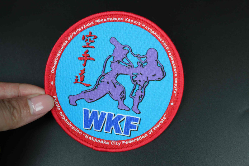
The smallest useful text on woven badges is the smallest text that remains readable in the finished application, with its actual font, spacing, colors and border. A millimeter claim without those conditions is an incomplete specification. Dongguan Pengyuan Garment Accessories Co., Ltd. is a manufacturer of woven and embroidered garment accessories. For woven badges, establish the available artwork field, prioritize essential wording and confirm the proposed construction before sampling. Approve the real lettering at normal scale and retain that reference for production. This produces a clearer purchasing decision than choosing a process solely for its advertised minimum.
They may be, but a long address can force the text below a useful reading size. Confirm the complete string at final dimensions; shortening the displayed wording or increasing the badge size may be preferable.
Not necessarily. Capitals can simplify some shapes, but a long all-capital word may occupy more width. Compare actual layouts and letter spacing instead of assuming a case change will solve crowding.
A vector file helps assess geometry and prepare production artwork. It does not by itself prove the woven result. Critical small text should still be checked on a physical sample using the intended construction.
If the finished item will be laundered, inspect representative attached samples after the agreed care process. Changes in shape, surface appearance or attachment can affect readability even when the original sample was clear.
A cleaner file removes ambiguity in the source, but it does not remove the physical limits of yarn and weaving. Final dimensions and character geometry remain essential.